A proportional font is a font in which different glyphs have different widths. This contrasts with monospace fonts, as used by typewriters and computer source code editors, which have one fixed width for all characters in a script. The ROM hacking community tends to refer to proportional fonts and text rendering engines supporting proportional fonts as variable-width fonts or VWF engines.
Logographic scripts using Hanzi/Kanji characters (Chinese, Japanese) and alphabetic scripts that arrange their letters in the same shapes as Hanzi, such as Hangul (Korean), ordinarily use monospace fonts. Latin, Greek, Cyrillic, and Hebrew ordinarily use proportional fonts, except on typewriters.
This is what the two kinds of fonts look like. Compare the width of small letter i to capital letter M.
| Fixed width | Proportional |
|---|---|
iiiiiii MMMMMMM |
iiiiiii MMMMMMM |

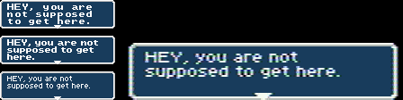
Video game consoles from the Intellivision to the Super NES, as well as Game Boy Advance, use a character cell grid of 8x8 pixel tiles. The "ordinary" way to display text on these is to load an 8x8 pixel or 8x16 pixel glyph of each character into RAM, and then write pointers to these glyphs to the "text page" or "nametable". The result is monospace text. To draw text in a proportional font on these systems, a program has to make a pseudo-bitmap out of several tiles. Few NES games did this, but several Super NES role-playing games did.

External links
- Wikipedia:Typeface#Proportion
- How to do a variable-width font on Super NES by Stealth Translations